Our user panel
- User 1 - Male, aged 35
- User 2 - Female, aged 22
- User 3 - Female, aged 26
- User 4 - Male, aged 45
- User 5 - Male, aged 81
Case Study · Banking · Mobile
End-to-end experience for opening a current account remotely on the AIB mobile app - from research and competitor analysis through low-fidelity wireframes, usability testing and high-fidelity prototypes.
AIB had identified that it was lagging behind its competitors because customers couldn't open accounts on the mobile app - instead, they had to use Internet Banking or visit a branch.
As people aged 65+ have access to a different product (the Advantage Account 65+), we decided to design two distinct user flows: one for the standard Current Account, and another tailored specifically for the Advantage Account for customers aged 65 and above.
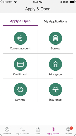
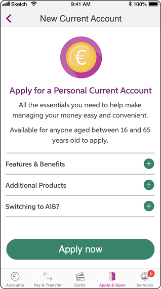
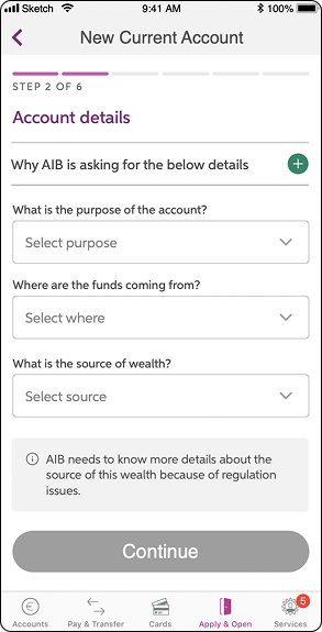
I stuck to AIB's Design System (DSM) to maintain consistency throughout the app. The project involved designing more than 60 different screens, each offering a customised experience based on the user's tax information, age and income.
To bridge the gap with competitors, I conducted an extensive analysis examining more than 30 different banks.
My privileged access to the Forrester platform - a tool that lets banks compare and exchange insights on design, flows and security - gave me a strong starting point. Armed with this knowledge, I sought out valuable insights and functionalities to incorporate into our project.
Below are some screenshots of competitors I benchmarked, with brief commentary on why each screen stood out.
Clear questionnaire onboarding pattern.
Strong use of "This / Or That" decision moments to inform downstream copy.
Friendly personalised hero with personality and product-discovery questions.
Tidy summary of products offered, easy to scan.
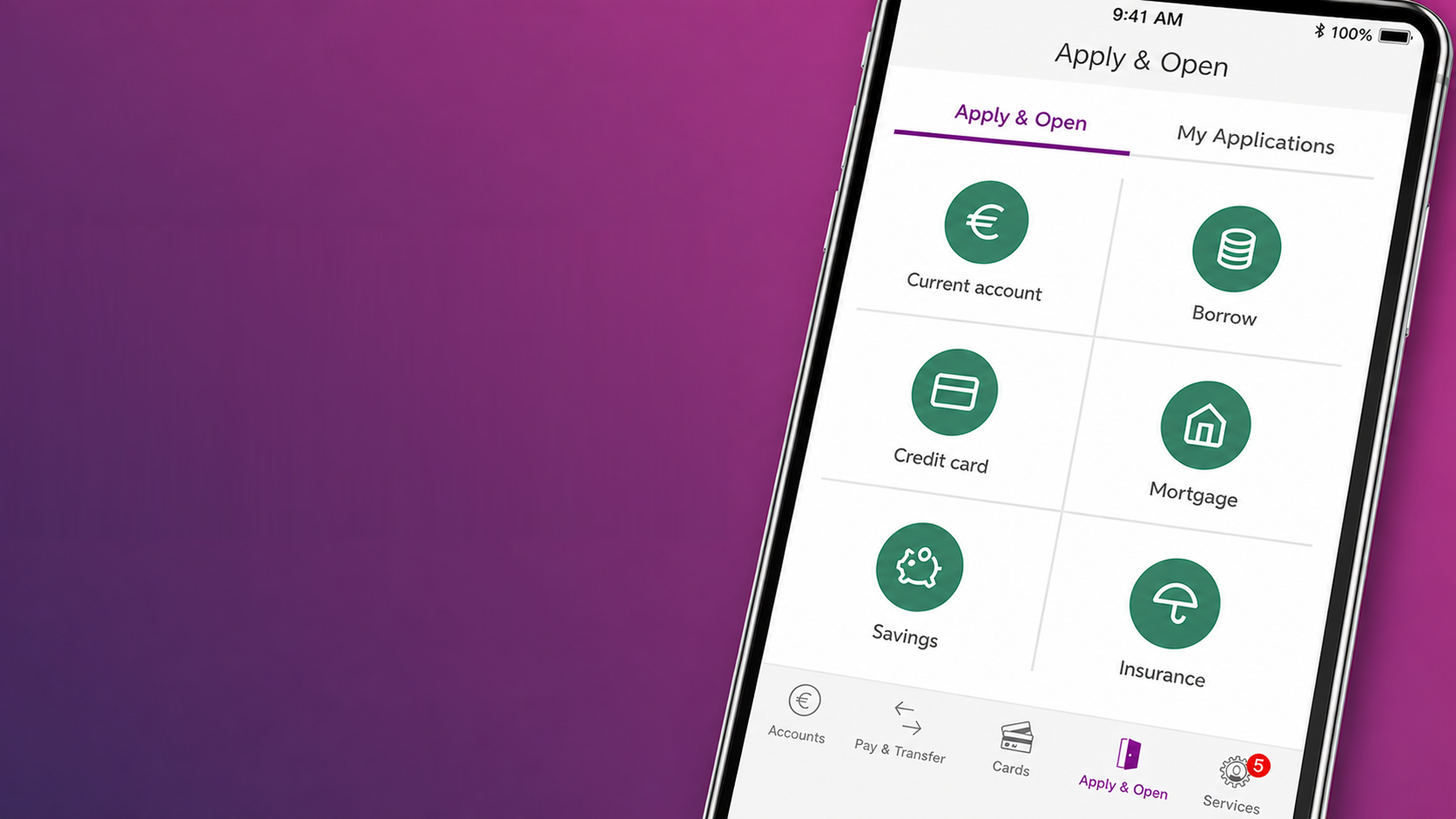
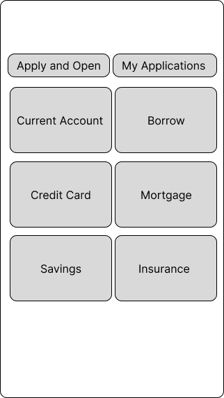
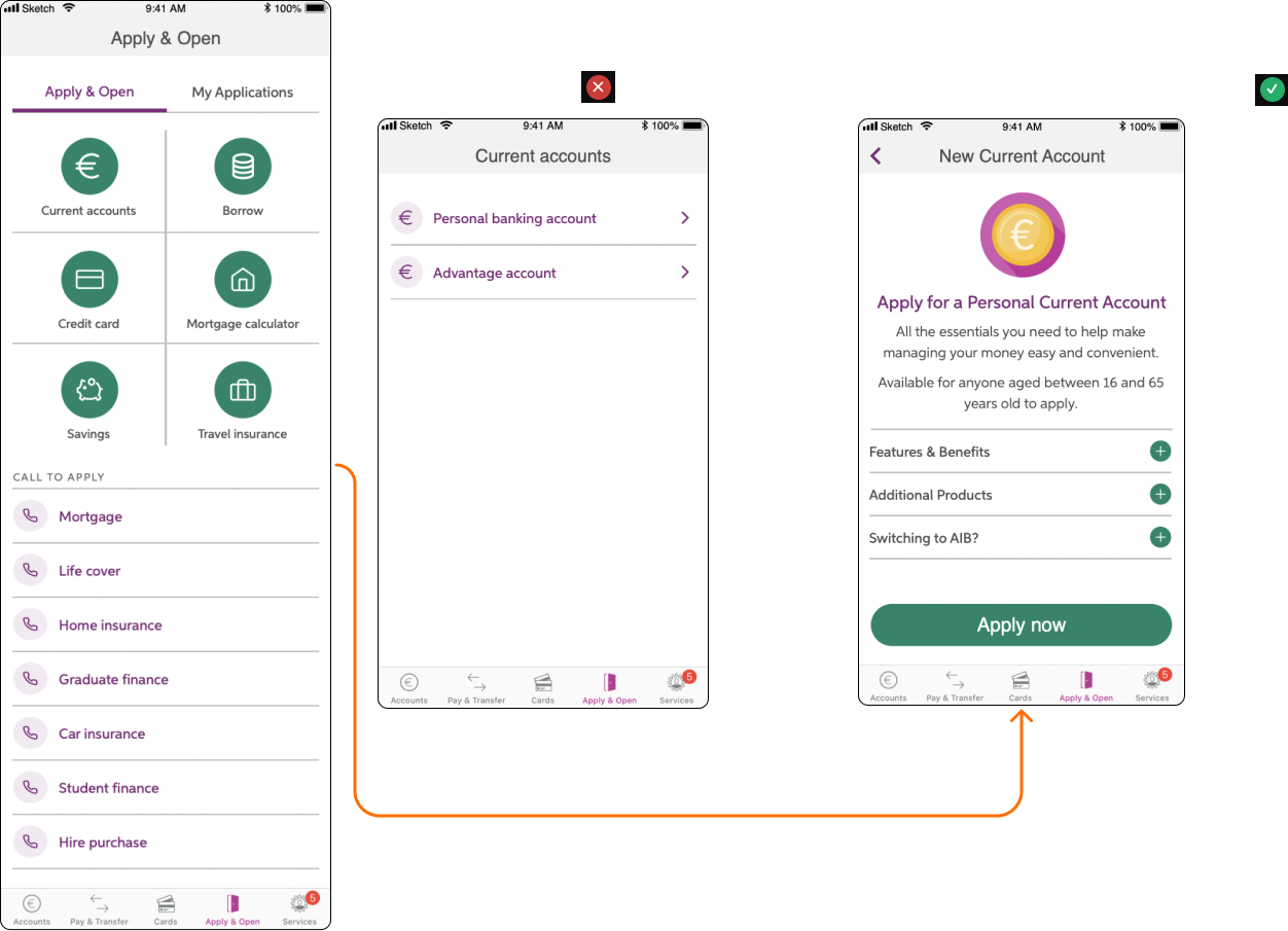
Mapping the end-to-end journey before pixel work - from "Apply & Open" through tax residency branching, all the way to a confirmation screen.
The flow is broken into 6 numbered steps: Personal Details & Contact → Account Details, Employment Type, Source of Wealth and Income → Irish, USA and Third-country Tax Residency (with branching for high-risk countries) → Digital Marketing → Documents → Summary & Confirmation.
If no
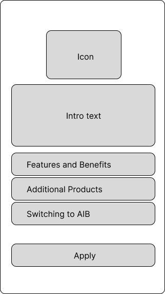
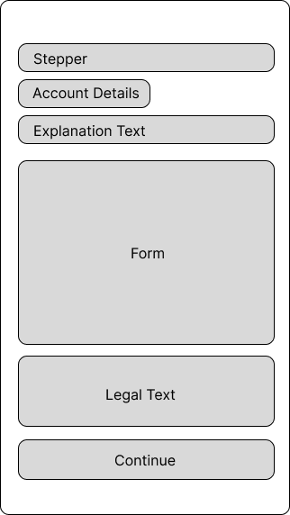
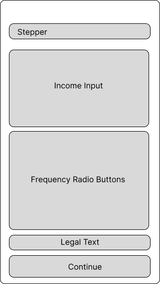
Wireframes to get layout, hierarchy and component placement right before jumping into pixel-perfect designs.
Each screen explored the structure of the form: stepper at the top, contextual explanation text, the form itself, supporting legal copy, and a primary continue action - keeping density and rhythm consistent across the journey.
This project had more than 80 screens; I'm sharing 4 examples here of how I normally work with low fidelity designs.
I asked the team to recruit 5 diverse users spanning various age groups so we could understand interactions with the screens and assess whether any adjustments were required.
5/5 - Knows where to go to open a new account.
100%
✓4/5 - Knows what current account feature means.
80%
✓4/5 - Knows what credit card feature means.
80%
✓4/5 - Knows what savings feature means.
80%
✓4/5 - Knows what borrow feature means.
80%
✓4/5 - Knows what mortgage calculator feature means.
80%
✓1/5 - Did not get the borrow option straight way.
80%
✓5/5 - Got the phone call option quickly.
100%
✓2/5 - Wouldn't have a problem to see the advantage account feature.
40%
✕2/5 - Knows how to apply for a new loan.
40%
✕4/5 - Does not know what green loan means.
80%
✕5/5 - Prefers 6 features instead 10 on the home screen.
100%
✓1/5 - Had some difficult to find the apply and open screen.
20%
✓1/5 - Had some difficult to understand the features at all.
20%
✓Most users said they didn't want to see the Advantage Account feature if they weren't aged 65+ - but if they understood what it meant, they thought it could be relevant for someone in their family. We decided to advertise it elsewhere rather than placing it inline, and to direct users aged 65+ straight to the tailored Current Account.
A subset of users also mentioned they had no clue what "guarded loans" meant and asked for clearer in-context explanations.
Following extensive testing and feedback, we proceeded to create the screens while adhering to AIB's Design System (DSM) and library.
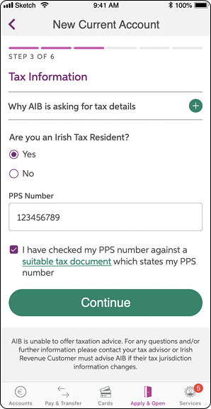
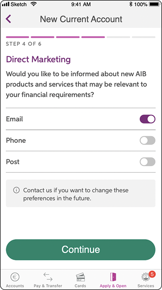
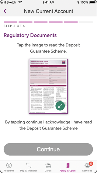
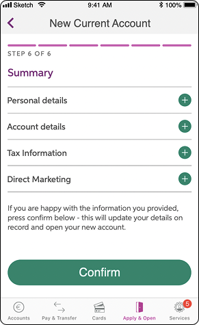
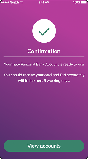
I introduced new elements into the DSM after receiving validation. The full flow has more than 60 high-fidelity screens - below are 8 of the most representative.
Our efforts bore fruit: users were eager to embrace the convenience of mobile account opening, eliminating the need for branch visits. After rigorous research, dialogue and testing, we shipped a product that resonated with users and led to a substantial increase in the number of accounts created, with minimal changes required during the final testing phase.
This project was particularly rewarding for me, as it enabled me to streamline bureaucracy and reduce time wasted. It was also my first time handling legal stakeholders - a lovely challenge as the communication was soft and pleasant, adding technical and legal terms when necessary alongside user-friendly language and functionality.
I take pride in contributing to an important product that now serves 50% of Ireland's population.
I wrote the design specs together with the product manager to make sure the flows developed work as expected, and I joined refinement calls to support engineers and architects during implementation.
To ensure pixel-perfect screens, I added images to the tickets with spacing specifications - colour was unnecessary because the dev team respected the existing bank design system.