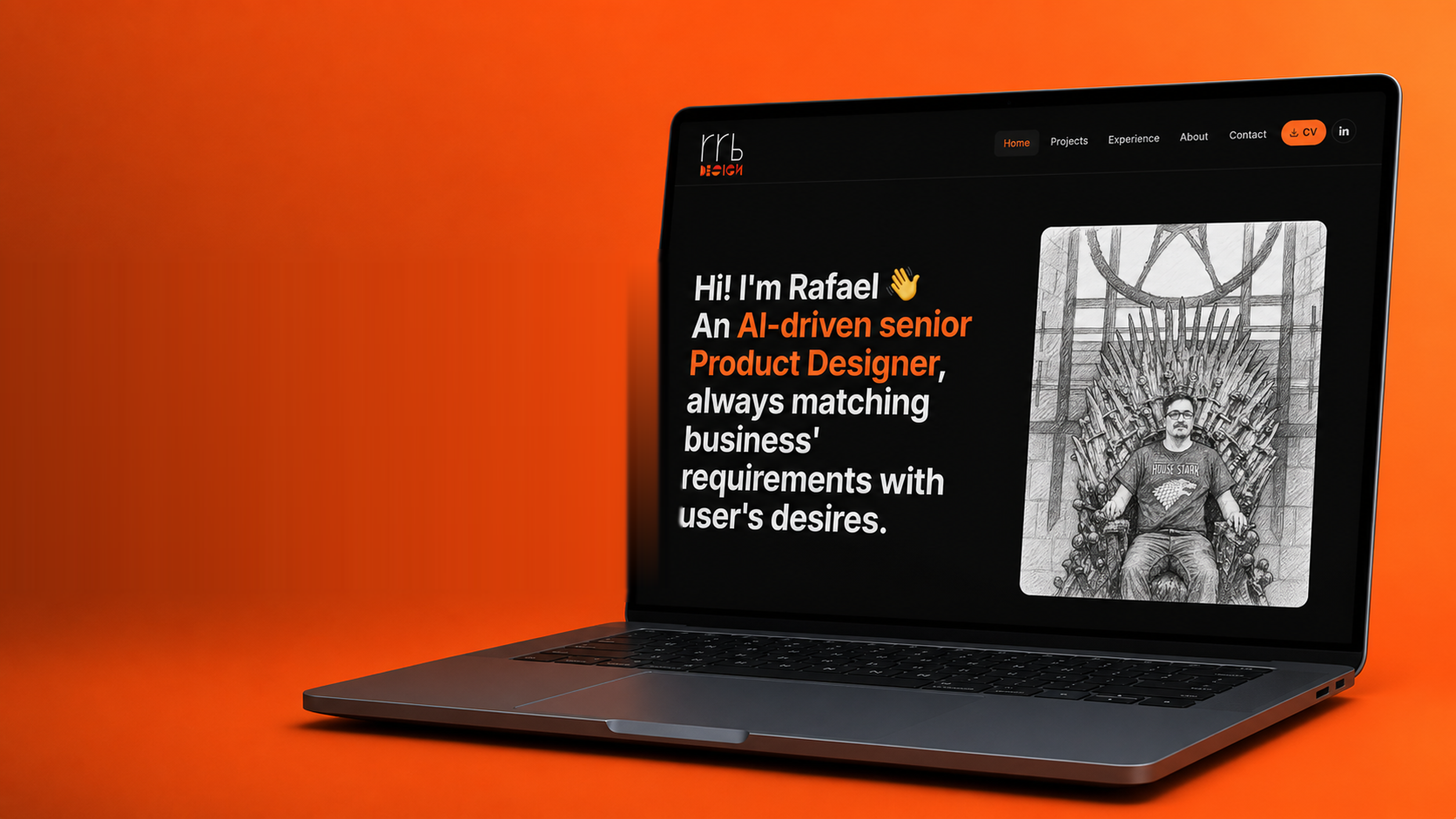
Case Study · Personal · Website

Building a UX Portfolio

Designing a modern UX portfolio platform built around how recruiters, hiring managers, developers and business stakeholders actually evaluate designers - focused on trust, clarity, storytelling and fast decision making.

Role
Senior Product Designer
Year
2026
Project Type
UX Research · Product Strategy · UX/UI · Information Architecture · Portfolio Experience

/ Problem to Solve

How I tackled the problem

Most designer portfolios focus heavily on visuals but fail to answer the questions hiring managers and recruiters actually care about.

Common issues identified during research

  • Poor storytelling
  • Lack of UX process explanation
  • Weak navigation
  • Excessive scrolling
  • Unclear contact information
  • Too many projects with little depth
  • Overdesigned interactions affecting usability
  • No prioritization between portfolio and CV
  • Limited personalization for different audiences

The project focused on designing a modern UX portfolio platform aimed at helping designers present their work more effectively to recruiters, hiring managers, developers and business stakeholders.

The challenge was not simply creating another portfolio website. The real problem was understanding what different audiences actually expect when reviewing a designer portfolio and how the experience could increase the chances of a designer getting hired.

The outcome was a portfolio experience designed around trust, clarity, storytelling and fast decision making. Recruiters and stakeholders often review portfolios under time pressure - so the platform needed to communicate value within seconds.

Business goal

Create a portfolio experience capable of:

  • Increasing recruiter engagement
  • Helping hiring managers assess designers faster
  • Making project case studies easier to consume
  • Highlighting UX process maturity
  • Supporting both junior and senior designers
  • Creating a scalable structure for future projects

/ Competitor Analysis

Several portfolio websites were analysed to understand industry patterns, strengths and usability issues.

Key references

  • Tomasz Strekowski
  • Adham Dannaway
  • Pascal Strasche
  • Wendy Schoor
  • Koco
  • Daniel Novkov

The analysis focused on

  • Navigation patterns
  • Storytelling structure
  • Responsiveness
  • Use of animations
  • Portfolio presentation style
  • CV accessibility
  • UX process visibility
  • Content hierarchy

Key findings

What worked well

  • Minimal colour systems improved readability
  • Strong visual storytelling increased engagement
  • Clear navigation reduced friction
  • Real sketches and process artifacts created trust
  • Responsive layouts improved accessibility
  • Simple introductions communicated value quickly

Main usability issues

  • Excessive scrolling created fatigue
  • Some portfolios hid important navigation items
  • Projects frequently ignored UX research phases
  • Heavy animations risked performance issues
  • Skill rating bars reduced credibility
  • CV download flows interrupted the experience

/ User Interviews

Interviews were conducted across multiple stakeholder groups - developers, recruiters, business owners, designers and marketing professionals - to understand how each audience evaluates portfolios and what influences hiring decisions.

Recruiters

Recruiters prioritised:

  • Fast understanding of experience
  • Clear portfolio access
  • Visible contact details
  • Professional experience before education
  • Simple navigation

Recruiters consistently preferred portfolios that reduced cognitive load.

Videos

Hiring Managers

Hiring managers focused more on:

  • Problem-solving ability
  • UX thinking
  • Business impact
  • Process explanation
  • Communication skills

They wanted evidence behind decisions, not only visuals.

Videos

Developers

Developers valued:

  • Clear design systems
  • Logical flows
  • Technical collaboration awareness
  • Structured thinking

Most developers said they'd only inspect frontend code if coding skills were relevant for the role.

Videos

Marketing Professionals

Marketing stakeholders emphasised:

  • SEO awareness
  • Personal branding
  • Clear messaging
  • Presentation quality
  • Business storytelling
Videos

Designers

Designers highlighted:

  • Balance between creativity and usability
  • Appropriate animation usage
  • Portfolio organisation
  • Visual consistency
  • Process visibility
Videos

The interviewee asked not to make the video public - if you want to see it, please send me a message.

/ Personas

Based on research, multiple personas were created to represent the primary audiences - and a scenario was built to illustrate how the portfolio plays a role in real hiring decisions.

Scenario

Priya Kumar (Head of Marketing) and Andrey Bondarenko (Head of Front-End Development) asked to have a meeting with the Head of UX Design, Freddy Okoro. During the meeting, they said that they were facing a huge backlog as the company didn't have enough designers, so they asked Freddy to open some roles. Andrey was stuck waiting for the design team to hand over digital projects; Priya needed her project done ASAP because the marketing team was about to launch online campaigns.

After the meeting, Freddy called Niamh McGuinness to ask her to open a new UX Design role. After some research, Niamh saw Rafael Basso's LinkedIn profile, talked to him for 30 minutes to see if he'd be a good fit, asked for a portfolio link, and - even though it isn't her expertise - really appreciated its design and handed Rafael's CV and portfolio to the hiring manager. To interview Rafael, Freddy asked Roberto Silveira (PO of the backlogged project) for help during the interview process, also showing him Rafael's portfolio.

After the process, Rafael was hired, the backlog disappeared, and the project helped the company skyrocket its sales.

Persona roles

  • Primary: Niamh McGuinness & Freddy Okoro - gatekeepers and decision makers.
  • Secondary: Roberto Silveira - no hiring power, but his opinion is extremely important to Freddy.
  • Tertiary: Andrey Bondarenko & Priya Kumar - raised the backlog issue and were shown Rafael's portfolio.

Personas

Portrait of Niamh McGuinness.

Niamh McGuinness - Recruiter

Irish, born and raised in Dublin · 34 · Single
Bachelor's in Psychology · Master's in Human Resources

About

Recruiter for IT, design and tech for 8 years at the same company. Loves partying with friends and visiting her parents in the countryside.

Goals
  • Get promoted and a raise
  • Simplify recruitment processes
  • Visit her parents frequently
  • Spend Christmas in New York (needs the hire commission)
Frustrations
  • Recruitment processes feel outdated and bureaucratic
  • Tired of asking for portfolios and only receiving PDFs or Behance/Dribbble pages
  • Stuck in the recruitment team - feels she could be the next Head of Recruitment
How Rafael's portfolio could help

His portfolio is great, so Freddy decides to move on with the interview. Rafael is hired, she gets her bonus and goes to NY for Christmas. Because of new processes she implemented, the time-to-hire is the fastest in the company.

Portrait of Freddy Okoro.

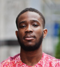
Freddy Okoro - Head of UX Design

Irish from Galway · Nigerian heritage · 38 · Married
Bachelor's in Arts & Design · Post-grad in UX Design · UX tools and management certs

About

15+ years as a designer - started as an intern during his arts and design studies, then moved into UX. Now leads the UX department.

Goals
  • Grow the UX/UI design team
  • Clear the design backlog
  • Speed up project delivery
  • Improve communication between UX, dev and stakeholders
  • Spend more time with family · take a second honeymoon
Frustrations
  • UX/UI team gets little recognition from the business side
  • Working overtime every day
How Rafael's portfolio could help

The materials show Rafael is a strong fit. His portfolio suggests he can help clear the backlog and speed up delivery, and his coding skills can improve communication with devs - meaning Freddy can finally stop working overtime.

Portrait of Roberto Silveira.

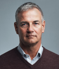
Roberto Silveira - Product Owner

Brazilian · 40 · 12 years in Ireland · Married, 2 kids
Bachelor's in Computing Science · Master's in Business

About

Was a developer in Brazil for 10 years - started as an intern and became head of development. Moved to Ireland for an English course, worked as a cleaner, then got a master's in business and his current PO role.

Goals
  • Clear the backlog
  • Speed up delivery
  • Better communication between teams
  • Second honeymoon
  • Raise his bilingual children
Frustrations
  • Too many meetings that could've been emails
  • Lack of investment in modern technologies
  • His team is overloaded
How Rafael's portfolio could help

Roberto sees that Rafael can communicate with different teams, and his coding skills can improve cross-team collaboration.

Portrait of Andrey Bondarenko.

Andrey Bondarenko - Front-End Developer

Ukrainian · 48 · 25 years in Ireland · In a relationship
Bachelor's in Computing Science

About

Immigrated to Ireland 25 years ago, having lived in London just after high school. Joined the company 6 months ago as Head of Front-End Development to help clear the backlog.

Goals
  • Clear the backlog
  • Speed up delivery
  • Learn more about design
  • Do a master's
Frustrations
  • Lack of investment in modern technologies
  • Poor communication between teams
How Rafael's portfolio could help

Andrey wants to learn more about design and Rafael is a UX mentor - a great fit. Rafael's coding knowledge can also help fix the cross-discipline communication gap.

Portrait of Priya Kumar.

Priya Kumar - Head of Marketing

Irish · Indian heritage · 33 · Single
Bachelor's in Marketing · Master's in Digital Marketing

About

Born and raised in Dublin. Single by choice - focused on her career, not on starting a family.

Goals
  • Launch a digital marketing campaign for the new product the UX/dev teams are building
  • Drive strong campaign results
  • Travel more
  • Pursue a doctorate
  • Learn more about UX processes
Frustrations
  • Devs and designers feel slow
  • Communication between teams could be better
How Rafael's portfolio could help

Rafael is a UX mentor and worked 6 years in a marketing team as a designer - so he can give her practical insights and help her grow her UX skills.

/ UX Strategy & Design

The platform structure was redesigned to prioritise recruiter and hiring manager workflows.

Low fidelity designs

Always starting with low fidelity sketches.

Final structure

Homepage

  • Short introduction
  • Featured projects
  • Quick access to CV
  • Contact CTA

Portfolio section

  • Categorised projects
  • Featured case studies
  • Business outcomes
  • UX process breakdowns

About section

  • Personal story
  • Experience
  • Skills
  • Collaboration style

CV section

  • Download option
  • Standard recruiter version
  • Creative version for hiring managers

Contact section

  • Persistent visibility
  • Multiple contact methods
  • Social links
Portfolio home - low fidelity wireframe (desktop). Portfolio home - low fidelity wireframe (mobile). Hero / about screen. Experience section. Education section. Contact section.

Key UX decisions

Prioritising portfolio before CV

Research showed stakeholders wanted to see actual work before reviewing a resume - this directly influenced the homepage hierarchy.

Limiting projects

Instead of showing every project chronologically, the platform focused on curated, high-quality case studies. This improved focus, decision-making speed and perceived quality.

Responsive storytelling

Case studies were designed to work across desktop, mobile, software and AI-focused projects. The structure prioritised quick scanning, progressive disclosure, visual hierarchy and readability.

Controlled animation strategy

The goal was creating engagement without harming performance or distracting users from the content.

Design principles

Simple

The experience should feel intuitive and easy to scan.

Human

The platform should feel personal and authentic instead of corporate.

Strategic

Every section should support hiring decisions.

Visual

Projects should communicate through strong visuals without sacrificing clarity.

Performant

Interactions should feel lightweight and responsive.

Final solution

The final portfolio concept combined:

  • Clear navigation
  • Strong storytelling
  • Structured case studies
  • UX process visibility
  • Business impact communication
  • Responsive layouts
  • Personal branding
  • Faster recruiter workflows

The platform balanced creativity with usability. Instead of overdesigning the experience, the solution focused on helping stakeholders make faster and more confident hiring decisions.

Outcomes

User experience outcomes

  • Reduced friction when reviewing projects
  • Faster understanding of designer capabilities
  • Improved accessibility of key information
  • Better visibility of UX process maturity

Business outcomes

  • Stronger professional positioning
  • Higher portfolio credibility
  • Improved recruiter engagement
  • Better storytelling for hiring conversations

Tools used

  • Figma
  • User interviews
  • Competitor benchmarking
  • Information architecture mapping
  • UX research synthesis
  • Responsive prototyping
  • Interaction design

Future improvements

  • AI-powered project recommendations
  • Personalised recruiter flows
  • Adaptive case study layouts
  • Analytics dashboard for engagement tracking
  • Accessibility optimisation enhancements
  • Dynamic filtering by role or industry

/ User Testings

Two moderated usability sessions were recorded with target users to validate the portfolio's structure, storytelling and key decision points.

Sessions

Conclusion from testing

Across both sessions, participants were able to find featured projects, access the CV and reach the contact section without hesitation - confirming that the homepage hierarchy, navigation and persistent contact entry points are working as intended.

Testers consistently praised the case study format for being scannable yet deep when needed, and singled out the orange-on-dark accent system as helping them locate key actions and section transitions.

The main improvement opportunities surfaced were minor copy refinements, tightening the spacing in long sections, and making the "Want to see more?" area at the bottom of case studies more visually distinct so readers naturally jump from one project to the next.

/ Conclusion

The project successfully transformed research insights into a portfolio experience focused on usability, storytelling and hiring efficiency.

By aligning the experience with the needs of recruiters, hiring managers, developers and business stakeholders, the platform moved beyond visual presentation and became a strategic product experience.

The result was a scalable, user-centred portfolio framework designed to communicate expertise, process maturity and business value in a clear and compelling way.

What I learned

  1. Hiring is a UX problem. Recruiters and hiring managers operate under time constraints - portfolio experiences must optimise for fast understanding.
  2. Storytelling creates trust. Users trust designers who explain decisions, not only visuals.
  3. Simplicity wins. Overdesigned portfolio experiences often create unnecessary cognitive load.
  4. Different audiences need different signals. Recruiters, developers, designers and business stakeholders evaluate portfolios differently.

Reflection

This project fundamentally changed how I think about portfolio design. Instead of treating portfolios as visual showcases, I started treating them as strategic products designed to support decision-making.

The research demonstrated that strong UX portfolios are not only about aesthetics - they're about clarity, trust, storytelling and helping people quickly understand the value a designer can bring to a business.